How Pantone Colors Our Trends and Times

Have you noticed how suddenly everything from clothing to couches is colored in soft shades of blue and pink? That’s because Pantone selected the shades of Rose Quartz pink and Serenity blue as 2016’s Pantone Colors of the Year. Each year, the color company chooses hues that set the trends in color for fashion, retail, design, and decor. Their selections are based on the insights of color psychologists and color economists who discern the emotions that colors prompt, as well as current societal shifts. And these choices have a huge influence on our personal visual preferences. For a look at how Pantone colors the choices of the world, Hubspot.com shared the dazzling details.
Shades of Pantone’s Past
In the 1950s, Pantone began as a company committed to creating color charts for cosmetics, fashion, medical, and industrial companies. But at the time, there was no standardized system of color, which led to great color confusion.
But this problem was solved in the 1960s by Lawrence Herbert, the new owner of the Pantone printing company. He had just completed a retail display card of pantyhose shades and had to hand mix the various shades of beige ink on each swatch because it was impossible to purchase the precise shades of ink since each ink manufacturer defined colors differently.
Herbert soon came up with the ideal solution by creating a standardized color system called the Pantone Matching System (PMS) that assigned a number to each shade. His universal color-specification system would allow anyone in any industry to request a specific color from any printer or manufacturer and be assured they’d receive the right shade.
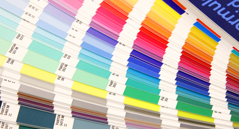
The new Pantone Matching System simply expressed each color as a number that could be universally understood. Herbert printed the numbered color chips in a fan-book format to provide designers and printers with a universal way to communicate about color. Ultimately, the Pantone Matching System established a common view and language of color that eased color standardization in graphics worldwide. And what started as a simple system of 10 color chips has evolved into a color matrix of 10,000 hues.
Today, Pantone has become a color conglomerate. It creates color standards for the fashion and interiors industry, in addition to consulting with brands and developing color-trend forecasting guides. The company is now also positioning itself as a lifestyle brand and expressing how having a Pantone-inspired product is a sign of good taste in design.
Its True Colors in Brand Marketing
Pantone is respected worldwide for both its longevity in the industry and savvy brand marketing. But this involves more than the science of creating and matching colors. The brand’s marketing strength also comes from their color psychologists and color economists, who understand the emotional impact of colors, rather than just their scientific makeup.
As a result, Pantone has discovered meaningful and memorable ways to form relationships with important designers, as well as enter licensing deals for products that spread the prestige and preference for Pantone worldwide. Some of its major marketing milestones include:
- National Geographic: The magazine’s bright yellow border became an iconic symbol that made the magazine globally recognizable.
- Tiffany & Co.: The jeweler secured its image in the minds of millions when it hired Pantone to create a standardized shade of robin’s-egg blue for its boxes. Today, this special shade of blue is trademarked and has become one of the world’s most well-known color associations.
- Instagram: Pantone has colored its Instagram feed to inspire the most color-obsessed among us. Its feed photos match color swatches to clothing, food, books, decor, and more. Their feed also spotlights designers who depend on its color guides, plus behind-the-scenes photos of the company’s colorful personality.
- Minion Yellow: In 2015, Pantone was selected to create the character color palette for the upcoming Minions movie. The company chose the characters’ bright yellow color to convey joy and optimism. The success of the movie and its lovable characters made Minion Yellow an iconic shade that’s now recognized everywhere.
Pantone has colored the world by providing a standardized view of colors for marketing, as well as marketing itself as an iconic creator of the colors of our lives.
Keep up with the latest trends in marketing. Contact MDG.
MDG, a full-service advertising agency with offices in Boca Raton and New York, NY, is one of Florida’s top branding firms. MDG’s capabilities include print advertising, direct mail marketing, branding, logo design, creative, media buying and planning, radio and TV advertising, outdoor, newspaper, digital marketing, website design and development, online video advertising, infographic development, email marketing, video marketing, mobile marketing, content marketing, social media marketing, paid search marketing, and SEO. To learn about the latest trends in advertising and branding, contact MDG today at 561-338-7797 or visit www.mdgsolutions.com.
