With News Feed Overhaul, Facebook Delivers Your “Personalized Newspaper”


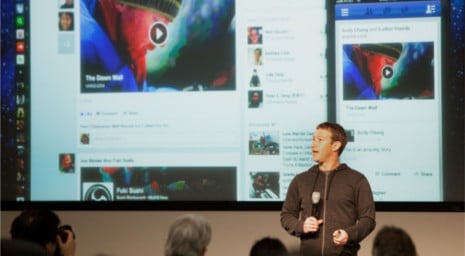
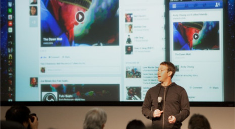
Facebook CEO Mark Zuckerberg at Thursday’s News Feed relaunch at the company’s Menlo Park, California headquarters. Photo: Alex Washburn/Wired
Facebook just announced that it has redesigned its News Feed to be better suited to today’s mobile lifestyles by appearing more like a “personalized newspaper.” Some new features include a bolder front page, more prominent images, and different sections for the user’s photos, friends, and music. The changes reflect Facebook’s goal of getting users to engage more often with the News Feed, status updates, and the various content that welcomes people upon log-in. Wired.com detailed the changes that Facebook hopes will make visiting the social media network a more frequent part of users’ lives.
“As what we all share changes, the composition of News Feed should change as well,” said Facebook CEO Mark Zuckerberg. “We want updates from our friends but also from publications and businesses we care about, so this is the evolving face of News Feed.”
Users will notice the more pronounced front page and its new division of sections for a layout that’s strikingly similar to the style of a newspaper. These separate sections will be highlighted in a menu in the top-right corner of the screen and include all kinds of information about the user’s friends, photos, games, following, music, and more. Interestingly, the menu’s order will adjust based on the frequency of section use.
Given the growing popularity of accessing Facebook on mobile devices, the News Feed has been optimized to be easily viewed and navigated on a complete range of smartphones and tablets.
In addition, Facebook has been steadily magnifying photo size over the last year-and-a-half, with its News Feed photos enlarged by 50 percent and Page Post images almost doubled to just below 30 percent.
The new design will start its rollout immediately, yet gradually, to let Facebook tweak the new look based on user feedback.
The News Feed has produced plenty of controversy recently among users regarding whether the company was selling preferred placement in the content stream and filtering to boost revenue. Facebook strongly denied these claims. Unfortunately, this redesign could further fuel the controversy by sparking speculation that the larger images are ideal for professional photos and videos, and that the more eye-catching layout more prominently promotes news from partner publishers. Taking a more positive view, the new design may just be a way for Facebook to show its users that it’s trying to improve their online experience and present the news in a more enjoyable way.
For now, the one thing that’s certain is that the changes will generate very strong opinions from Facebook’s one billion users worldwide. With that many people using the network, Facebook must be doing something very, very right.
To learn more about integrating Facebook into your social media marketing strategy, contact MDG.
MDG, a full-service advertising agency with offices in Boca Raton and New York, NY, is one of Florida’s top integrated marketing agencies. Our 360° approach uses just the right mix of traditional and digital marketing to reach your advertising goals. While some industries may fare better in print and others online, we strive to create a balanced approach, where traditional, social media, and digital marketing efforts support each other and your message is tailored to the medium. To stay on top of the latest Facebook trends and what’s new in social media marketing, contact MDG.
Read more at Wired.com.
