Wendy’s Logo Gets First Update Since 1983


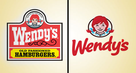
Its evolution into a higher-end hamburger franchise has led Wendy’s to update its logo for the first time in almost 30 years and only the fifth time since the first restaurant opened in 1969. The new logo design has traded the traditional look of the previous image in favor of a cleaner and more contemporary style that conveys a more casual image. FoxNews.com reported on how the logo redesign is hoped to help Wendy’s take a bite out of the competition.
Over the last few years, the quick-service industry has seen the rise of more upscale restaurant chains, which are perceived as providing better or fresher alternatives to conventional fast food. As a result, Wendy’s desire to shed its fast food image has inspired the brand to upgrade its menus and restaurants. Now, those enhancements have extended to its logo design.
The brand’s name and original logo were inspired by the daughter of Wendy’s founder, Dave Thomas. Her younger siblings couldn’t pronounce her real name of Melinda Lou, so they called her Wendy. Her father though the name evoked a wholesome and all-American image, so he adopted it for his new restaurant company, along with her freckled face and bright red pigtails which became the legendary logo for the brand.
In updating it, the logo design team realized that they needed to maintain the logo’s iconic elements of a little girl, the color red, and the distinctive tilt of the brand’s name. Their work resulted in a fresher and less formal style, with the little girl’s face as the focal point and the restaurant’s name casually written in bolder, bright red letters.
The new logo design is scheduled to appear on locations in March 2013, but the restaurants are already undergoing numerous improvements meant to enhance their overall appearance and the customer’s experience. The company has focused its efforts on adding more natural lighting, along with a range of more comfortable seating options and flat-screen TVs in an effort to create a warmer and more welcoming environment where customers can relax and enjoy themselves. Menus are evolving to include more upscale offerings in an effort to improve the perception of the chain’s quality and healthfulness, as well as keep up with the variety offered by competitors. Even the employees’ uniforms will be tweaked to have a more tailored appearance. These enhancements will expand to all of Wendy’s approximately 6,000 locations in North America.
While the upgrades continue to be rolled out, the company has already seen signs of success. Sales at locations open for at least a year have risen for the last five quarters.
“Our goal is to be a five-star restaurant at a three-star price,” said Wendy’s CEO, Emil Brolick.
To learn how creative logo design can increase marketing success and drive sales for your quick-serve restaurant, contact MDG today at 561-338-7797, or visit www.mdgsolutions.com.
MDG, a full-service Florida advertising firm with offices in Boca Raton and New York, NY, specializes in developing targeted Internet marketing solutions, exceptional creative executions and solid branding and media buying strategies that give clients a competitive advantage. Our core capabilities include branding, logo design, creative, digital marketing, print advertising, media planning and buying, TV and radio, website design and development, email marketing, social media marketing, and SEO.
Read more at Foxnews.com.
