7 Big Design Mistakes to Avoid on Social Media

Social media can be a design wonderland for brands. Constantly evolving user behaviors and content formats give marketers exciting opportunities to experiment with new visuals and connect with audiences in fresh ways.
But social media can also be challenging. Because the networks change so quickly and have such different structures, it can be easy to make design missteps that annoy users and dampen engagement.
What are the design pitfalls that marketers should make sure to steer clear of? Which major errors tend to be noticed by consumers? Here are seven key design mistakes brands of all types should avoid on social media:
1. Using Incorrect Image Sizes and Resolutions
The wrong approach: The correct sizes for key design elements—headers, avatars, etc.—vary among different social networks. Moreover, within each platform, there are different size guidelines for different experiences. On top of all that, there often is a range of resolution requirements for images and graphics. Getting any of this wrong is a huge mistake: design elements at the wrong sizes and resolutions display poorly and are quickly noticed by audiences.
The right approach: There’s no shortcut here—you have to determine the optimal sizes and resolutions for each social platform and then develop variations of your creative to meet these requirements. To find out what’s needed for different networks, check out an up-to-date guide like this one.

2. Failing to Account for Small Mobile Screens
The wrong approach: Some 96% of Facebook users access the platform on a mobile device, compared with only 25% who use a laptop or desktop. For mobile-first platforms like Instagram, the number of people using smartphones and tablets is close to 100%. Yet many brands continue to design primarily with laptops and desktops in mind, developing images and graphics that look great on big test screens but don’t scale down well in real-life mobile situations.
The right approach: BuzzFeed is a savvy organization that understands the device behaviors of today’s social media audiences. The publisher shows this in its designs, such as backgrounds and icons, which are simple and stand out on small screens.

3. Creating Designs That Are Too Busy
The wrong approach: The combination of small mobile screens and lots of content competition means that busy designs often get lost. To stand out among a flood of other pieces on small screens, less is often more. The clearer and more easily recognizable a visual is, the more likely it is to get noticed.
The right approach: In less than five years, Kylie Jenner has built her cosmetics company into a behemoth worth hundreds of millions of dollars primarily through social channels. The posts are usually not flashy or overly complicated: they simply—and effectively—showcase products with clear visuals and plain backgrounds.

4. Utilizing Too Many Fonts
The wrong approach: What a wonderful time it is for fonts. There are now so many for brands to choose from—serif fonts, sans-serif fonts, script fonts, decorative fonts, oh my!—that it can be tempting to use as many as possible on social media. Don’t do it. More fonts mean more for people to process, which can lead to audiences disengaging.
The right approach: It’s fine to (judiciously) use a few different fonts if you want to convey a hierarchy or make something such as the headline on a graphic stand out. That said, there’s also a lot to be said for consistency. Throughout its history, including on social media, Apple has stuck to core typography, ensuring that audiences associate even the look of letters with its brand.

5. Over-Relying on Generic Stock Imagery
The wrong approach: As content production has ramped up and turnaround times have shortened, marketers have come to rely more and more on stock services for their visuals. The problem is that this can lead to posts from different brands looking alike. Because the same generic images are used over and over, designs tend to blend together.
The right approach: A number of brands such as the email platform Mailchimp have invested in developing their own imagery and illustrations, ensuring that their content stands out in social feeds. Even if that’s not possible because of time and/or cost constraints, marketers can still utilize stock imagery in creative ways by adding filters/overlays and by making unconventional choices.

6. Not Tailoring Designs to Individual Platforms
The wrong approach: In the rush to publish social posts, brands sometimes forget that all social platforms are not the same. There are variations in user behaviors, feed displays, and design requirements that should be accounted for. Content that’s blasted across all networks without being optimized can feel out of place.
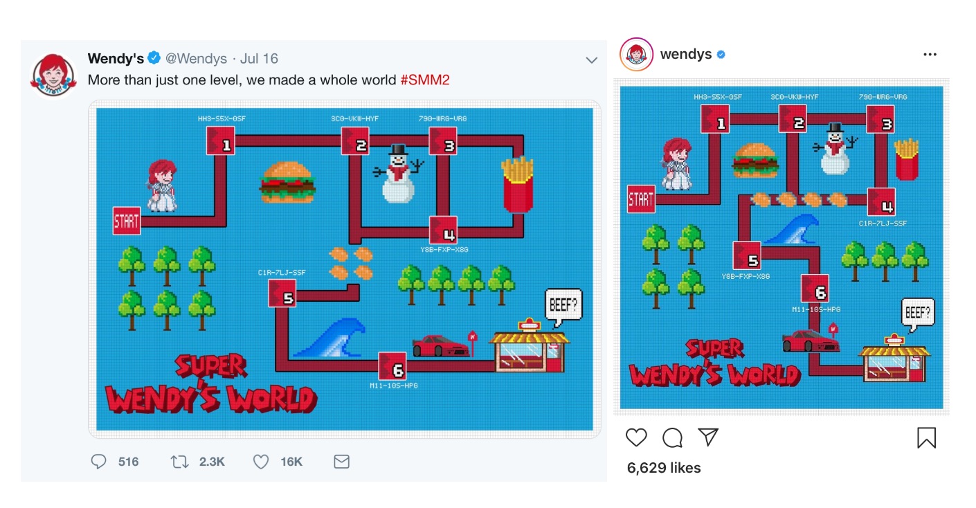
The right approach: Wendy’s is one of the most social media–savvy organizations, and that shows in how it tailors its pieces for various platforms. In the examples below—one from Twitter and one from Instagram—different versions of a graphic were created to ensure that the content displayed well in different feed formats. These sorts of changes may seem slight, but making them can have a big impact on engagement.

7. Having an Inconsistent Brand Identity
The wrong approach: When it comes to social media content, brands must walk a fine line: posts should feel distinct, but they should also have threads that unite them. Without this visual consistency—without a brand identity—pieces can feel disconnected and their impact can be lessened.
The right approach: A brand identity doesn’t mean that every post should be identical. Rather, there should be a few consistent elements and an overarching visual feel. This can be seen in the two tweets below from Nike, which were separated by two months. Many elements are different, such as the color and framing, but the swoosh logo connects them, as does the modern, triumphant tone of the two images.
 Ultimately, good design on social media is comes down to getting both the big and small things right. Brands must maintain a focus on details such as image sizes and fonts while not losing sight of broad platform behaviors and the need for an overarching visual identity.
Learn how to avoid design mistakes on social media. Contact MDG today at 561-338-7797 or visit www.mdgsolutions.com.
MDG, a full-service advertising agency with offices in Boca Raton and Brooklyn, NY, is one of Florida’s top branding firms. MDG’s capabilities include print advertising, direct mail marketing, branding, logo design, creative, media buying and planning, radio and TV advertising, outdoor, newspaper, digital marketing, website design and development, online video advertising, infographic development, email marketing, video marketing, mobile marketing, content marketing, social media marketing, paid search marketing, and SEO. To learn about the latest trends in advertising and branding, contact MDG today at 561-338-7797 or visit www.mdgsolutions.com.
