5 Key Areas to Focus On to Boost E-Commerce Conversions
How can you increase the conversion rates on your e-commerce site?
The question is simple but the answers often feel incredibly complicated. The options for boosting performance can seem endless and overwhelming—on most websites there are countless combinations of colors, words, buttons, images, and layouts that can be tinkered with to wring every last click out of visitors.
Before you disappear into a black hole of never-ending tweaking, here are five tactics that truly increase click-throughs/purchases. Each is relatively simple to execute and has been proven to significantly boost conversions:
1. Include Product Endorsements/Reviews from Users
Why does Amazon place a product’s average star rating from consumers and the total number of reviews before other key pieces of information such as price and shipping? Because user reviews/ratings are incredibly effective in convincing consumers to take action.
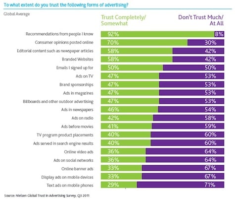
A Nielsen report from a few years ago found that 90% of consumers online trust recommendations from people they know, and 70% trust the opinions posted online by unknown users. This trust level was higher than in any other source, including website content, advertising, and editorial content from third parties.
Basically, if you think consumers aren’t converting because they’re unsure of a product’s quality, make sure to display reviews/ratings as prominently as possible. Also, do everything you can to convince users who do convert to come back and leave product reviews/ratings.
2. Provide shipping-availability indicators.
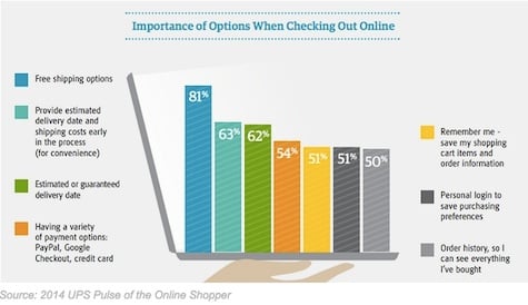
It cannot be stressed enough how much consumers care about shipping. A recent survey of online shopping preferences found that people rank shipping options as the most important information at checkout, ahead of payment choices and personalization. That particular report came from UPS, so there’s some bias, but earlier surveys from other sources found the same thing.
If you sell physical products and your shipping options are a competitive advantage (faster, cheaper, etc.) make sure to put them front and center as early in the process as possible. Even if they’re not standout, it’s still important to display shipping options so they’re visible almost immediately—often, simply not knowing when products will arrive is a major barrier to conversion.
3. Include upsell opportunities.
A number of powerful conversion-boosting tactics actually come from good ol’ brick-and-mortar selling. Chief among these is including upsell opportunities wherever possible.
Why? Because upselling has two benefits:
- It provides more conversion opportunities, so consumers may buy at least one product from you even if it isn’t the original intent.
- A good up-sold bundle can make the initial product more appealing and spur a conversion.
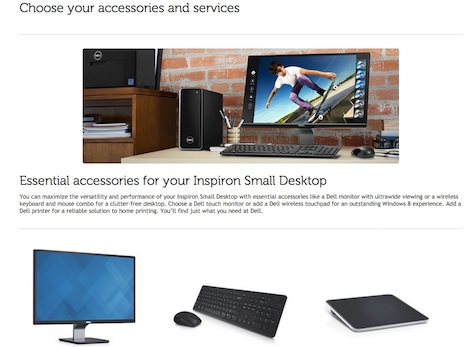
The key here is quality data and delivery. Trying to upsell a wool hat to a consumer when they are looking at tax software is a difficult proposition, but providing suggestions for monitors that match a particular desktop computer being considered is both compelling and useful (for example, what Dell does below).
4. Refine your value proposition messaging.
One of the biggest mistakes e-commerce companies make is to not test their value proposition messaging.
Yes, your copy, format, and colors may work well, but it’s always possible to make them more effective. Moreover, different versions may work better for different audiences.
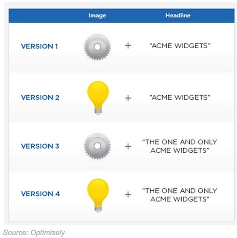
Of course, refining your messaging sounds great, but how do you actually go about doing it? The key is to test different options using a structured plan. Thanks to companies like Optimizely and others, this is easier than ever.
With a bit of thought, you can easily create a messaging testing plan, then refine your options until the complete proposition is as powerful as possible.
5. Encourage “Add to Cart” visually.
Finally, no discussion about e-commerce conversions would be complete without discussing the “Add to Cart” feature, which is at the heart of purchases for many businesses.
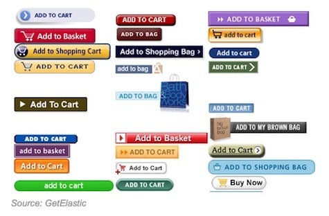
The first rule of conversions is to encourage this action visually, with a button/icon of noticeable size and bright colors.
However, the tricky part is that there’s no single ideal Add to Cart message. As with much of e-commerce, it varies widely so you’ll have to test and test some more.
Not sure which options to try? This post from GetElastic shows what 107 top retailers use.
Learn new tactics for boosting your brand’s e-commerce conversions. Contact MDG today at 561-338-7797, or visit www.mdgsolutions.com.
MDG, a full-service advertising agency with offices in Boca Raton and New York, NY, is one of Florida’s top branding firms. MDG’s capabilities include print advertising, direct mail marketing, branding, logo design, creative, digital marketing, media buying and planning, radio and TV advertising, Web design and development, online video advertising, infographic development, email marketing, content marketing, lead generation, social media marketing, and SEO. For the latest trends in advertising and branding, contact MDG today at 561338-7797 or visit www.mdgsolutions.com.

